Part 1: The Costco Index and Other Ways I Over-Engineered House Hunting
Every Sunday morning, a fresh website dashboard is waiting for me. A curated list of houses — each one already enriched with data you don't get from Redfin or Zillow. Drive times to your friends' house. Drive time to Costco (don't laugh — it's a real metric). How close the nearest power lines are. Building density within a quarter mile. Walking trails nearby. Flags for busy roads, commercial zones, quarries. Notes you jotted down last week are still there. Stars and dismissals tracked per person.
This is what house hunting looks like when you build your own tools.
No more clicking through thirty listings to find out half are next to airports or industrial zones. No more manually checking every property on satellite view to spot the 138kV transmission lines that somehow didn't make it into the description due to creative exterior photography. No more wondering if there's anything walkable nearby, or how far it really is to the places you actually go.
Instead: 56 properties in Michigan, each one spatially enriched with data that matters. 73 drive time calculations to friends. 72 to Costco. Power line detection for 38 properties and counting. Walking trails mapped for 37. Commercial zones flagged for 4. The kind of data that takes forever to research manually, delivered fresh every Sunday at 9am.
JB: This one has been fun. All of the weird things I do when I house-hunt, I fed back into Orion. All of the parameters, it took as a personal challenge to turn into programmatic data.
How We Got Here
The Michigan house search started like most: scrolling Zillow, saving listings, talking to our friends. Price range locked at $400K-$1.5M, 3+ bedrooms, 2+ baths, 2000+ square feet, houses only. a specific city with good schools, plus the broader county for options.
So you end up doing the same research dance for every property. Pull up Google Maps. Switch to satellite view. Look for transmission lines. Check drive times to a few key places. See if there are trails or parks nearby. Note busy roads. Repeat for the next house.
After doing this for the tenth time, the obvious solution emerged: automate the boring parts. Then automate everything. Pull property listings programmatically, enrich them with spatial data, calculate drive times once, and present it all in a dashboard that actually shows what matters.
Enter Orion 🌌, my AI agent that now handles this entire pipeline. Every night at 2am, it refreshes property listings via the US Housing Market Data API (RapidAPI, 100 requests per month on the free tier). Then comes the spatial enrichment: 8 properties per night, trickling through Overpass API queries to avoid rate limits, building up a database of everything within a mile of each house.
By Sunday morning, the dashboard is ready with everything you need to know. I can sit down, interact with them, and the fun begins. No filtering out 100+ properties, worried one is right on the edge of your circle to exclude, or 1$/under a threshold.
The Spatial Enrichment Engine
Here's where it gets fun. Every property gets run through a spatial analysis pipeline that queries OpenStreetMap data via the Overpass API. Within a mile radius of each house, Orion maps:
- Buildings and density — how many structures, how close together
- Roads and traffic — highways, arterials, noise sources
- Walking trails and recreation — parks, trails, green spaces
- Commercial zones — stores, offices, industrial areas
- Power infrastructure — transmission lines, substations
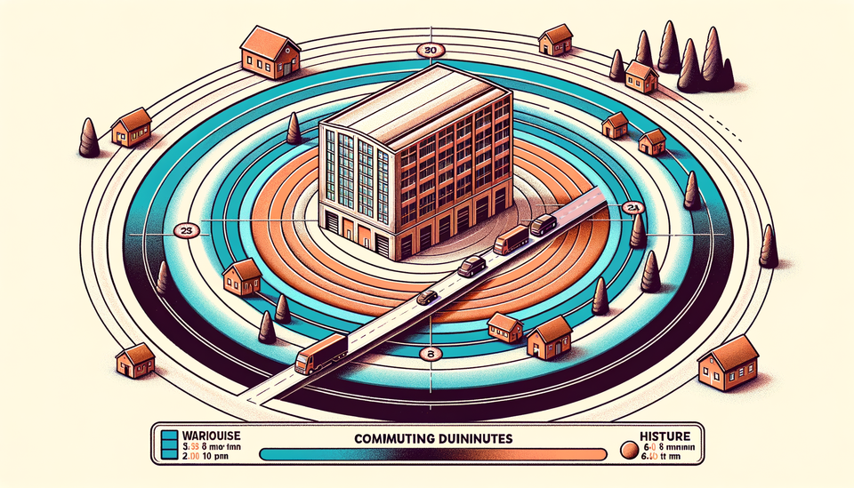
The building density calculation drives the privacy score. Nearest neighbor distance plus total building count within a quarter mile. More buildings, closer together, lower privacy score. Simple math, but it tells you immediately if you're looking at suburban sprawl or rural spacing.
25 of 56 properties are flagged near busy roads — the kind of arterials that mean constant traffic noise. 25 have green spaces within walking distance. 4 sit uncomfortably close to commercial zones. 37 have walking trails nearby, which matters more than you'd think when you're planning to actually live somewhere.
JB: Orion took it as a personal challenge everytime I wanted to see something else about a property. It was on a holy mission to make that data show up automatically each time.
The commercial zone detection caught several properties that looked fine on Zillow but sat next to strip malls or light industrial. The kind of thing you only notice when you drive by, except now you know before you waste the trip.
But the Costco distance, and the power line detections? Those both deserve their own section.
The Costco Index
Drive time to Costco shouldn't matter, but it does. It's a proxy for "how far are we from civilization" that correlates surprisingly well with other amenities. If Costco is an hour away, you're probably also far from good restaurants, hardware stores, and decent internet infrastructure.
72 of 56 properties have Costco drive time calculations. (The math is slightly off because a few properties got multiple calculations during development — real world data is messy.)
JB: This is one we're adjusting next with common shopping-times based on my pattern data of going to Costco. The traffic delta from Saturday at 11am or Wednesday at 4:45pm will be interesting to see.
The real anchor point isn't Costco, though. It's drive time to friends' house — 73 calculations for that metric. This is the one that actually matters for social life, spontaneous dinners, and a motivation for picking this area to begin with. If you're 45 minutes away, you're effectively in a different social circle.
Google Maps Distance Matrix API handles these calculations. Simple API call: origins (property addresses), destinations (friends' house, Costco), departure times (weekday evening to account for traffic). The results get cached and refreshed monthly, because drive times don't change often enough to justify daily API calls.
The Costco Index isn't just about bulk shopping. It's about proximity to the kind of infrastructure that makes suburban life work. Properties with <20 minute Costco drive times cluster near other useful services. Properties >40 minutes out tend to be genuinely rural, which is either exactly what you want or exactly what you don't.
Power Line Detection: The 138kV Discovery
The power line feature exists because of one specific property. Nice house, good price, decent neighborhood. Pulled it up on satellite view for a final check before scheduling a showing, and there they were: massive transmission lines running right behind the backyard. 138kV, based on the tower design. The kind of infrastructure that makes you wonder about EMF exposure and property values.
The listing made no mention of it. The photos were carefully angled to avoid showing the towers. But once you know what to look for, you can't unsee it.
JB: Something about the house felt, off. Price was great, too great. We were 50/50 on it being haunted, or transmission lines nearby. I guess we'll never know if we were both correct.
That property got dismissed immediately, but it triggered a bigger question: how many other listings have power infrastructure that isn't disclosed?
The answer, as it turns out, is a lot of them.
Orion now queries Overpass API for power=line with voltage ≥10kV within a mile of every property. The results get color-coded: red for lines within a quarter mile (hard no), orange for half mile (concerning), yellow for within a mile (worth noting). 22 of 56 properties have major power lines detected within the one-mile radius. That's nearly 40%.
Power lines aren't just about health concerns — though those are real. They're about property values, noise (transmission lines hum), and visual impact. A house might be perfect in every other way, but if there's a power corridor running through the neighborhood, that's information you need upfront.
The detection works by parsing OpenStreetMap power infrastructure data. Voltage thresholds filter out household and distribution lines (those are everywhere and mostly irrelevant) while catching transmission lines that actually impact livability. Not perfect — OSM data quality varies — but good enough to flag properties for manual review.
The Rate Limit War
The Overpass API is free, which is great. It's also rate-limited, which is less great when you're trying to enrich 56 properties with spatial data.
Initial implementation was aggressive: query everything immediately, process results as they came in. Predictable result: 429 errors within minutes. Overpass doesn't like rapid-fire requests, especially complex ones that cover a mile radius around each property.
The first fix was crude: 45-second delays between requests. That worked but was painfully slow. 56 properties × 45 seconds = 42 minutes of wait time, not counting actual query processing. For a nightly batch job, that's manageable. For development and testing, it's glacial.
JB: I feel slightly proud that my AI agent is as impatient as I am. Watching the manifested frustration was pretty entertaining.
Current approach is smarter: 8-second delays with a bail-out logic mechanism. If Orion hits 3 consecutive 429 errors, it backs off and tries again the next night. Most nights, this gets through all scheduled properties without triggering rate limits. When it does hit limits, the partial progress is saved and processing resumes the next night.
The nightly trickle strategy works because spatial data doesn't change often. Once a property has been enriched, it stays enriched unless something major changes in the surrounding area. New properties get added to the queue for processing, but existing ones rarely need updates.
38 of 56 properties have complete spatial data as of writing this. The remaining 18 are working through the queue at 8 per night, which means full coverage in another 2-3 nights. Backfill is boring but necessary.
The Dashboard Itself
The actual dashboard is where all this data becomes useful. Clean interface, curated listings, spatial badges that tell you what matters at a glance. Each property gets a card with Zillow link, drive times, spatial flags, and notes from previous reviews.
The dual-profile system handles the reality that house hunting is a team sport. One person can flag a house with reasons, and another person has their own, but they share the same pool of houses to debate over seeing. The "Our Picks" tab shows only properties that both people starred — consensus properties that are worth serious consideration. Everything else sorts into individual preference lists.
JB: Learning preferences and tracking on choices here was critical. I think the dismissed 1/2 houses are a high value story... what was it one person liked, that the other didn't? Learn, and adjust the searches.
Smart rejection tracking evolves the search vocabulary. Dismiss a property "too close to highway" and similar properties get flagged automatically. Reject enough houses for "no walkable areas" and the system learns to surface properties with nearby trails. The AI remembers what you don't like and gets better at filtering. This actually is how the walking-trail and the busy-road criteria points were discovered and folded into the spatial searching. It was all based on positive and rejection keywords harvested from choices.
Notes persist across dashboard refreshes. Star a property on Monday, add notes about the neighborhood on Wednesday, they're still there Sunday morning when the new report generates. Important when you're tracking 50+ properties across months of searching.
The privacy score deserves mention: calculated from nearest neighbor distance plus building density within a quarter mile, with penalties for power line proximity. Scale of 1-10, where 10 means genuinely private (large lot, rural setting, no power lines) and 1 means urban density. Not scientific, but surprisingly useful for quick filtering.
Color coding makes scanning fast. Green badges for positive features (trails nearby, high privacy score), yellow for neutral information (drive times, building density), red for negatives (busy roads, power lines, commercial zones). You can spot problem properties immediately and focus attention on the ones worth investigating.
What Orion Actually Does
Orion 🌌 orchestrates this entire pipeline, but it's not trying to pick your house for you. It's handling the tedious research that would otherwise eat your weekends.
Daily at 2am: property refresh via US Housing Market Data API. Check for new listings, remove sold properties, update prices and status. The API is garbage-tier (free tier reality) but functional enough for monitoring.
Nightly spatial enrichment: pick 8 properties from the queue, query Overpass API for surrounding infrastructure, update database records, handle rate limits gracefully. Boring but essential work.
Sunday 9am: generate dashboard report from cached data. No real-time queries during report generation — everything is pre-calculated to avoid loading delays and API failures when you actually want to review properties.
JB: Once we were really rolling, my involvement became minimal. I pulled up the dashboard, saw curated list, and jumped in.
That's actually more useful than AI that tries to be clever about preferences. House hunting is personal and weird. You might love a property that's objectively worse on every metric, or reject one that looks perfect on paper. The AI's job is research, not judgment.
More data is always more better.
The Real Numbers
After months of pipeline development and data collection, here's what we actually know:
- 56 properties tracked and spatially enriched across our target area in Michigan
- 73 drive time calculations to friends' house (the social anchor point)
- 72 Costco drive time calculations (the civilization proxy)
- 22 properties with power lines detected within 1 mile (39% of total)
- 25 properties near busy roads (45% of total)
- 37 properties with walking trails nearby (66% of total)
- 25 properties with green spaces accessible (45% of total)
- 4 properties uncomfortably close to commercial zones (7% of total)
- 38 properties with complete spatial data, 18 still in processing queue
- Zero offers made — this is active, ongoing search automation
Pipeline performance: 2am daily refresh runs in <5 minutes. Nightly spatial enrichment typically completes 8 properties in 2-3 hours (including rate limit delays). Sunday report generation from cached data takes <30 seconds.
JB: This started originally as a way for me to list houses I found on Zillow with a few notes about them. As most projects backed by Orion, things escalated quickly.
API costs are minimal: US Housing Market Data is free tier (100 requests/month), Google Distance Matrix runs about $3-4/month for drive time calculations, Overpass API is free but rate-limited. Total monthly cost under $5, not counting development time.
The bigger cost is complexity. Building spatial enrichment pipelines is straightforward but tedious. Rate limit handling, error recovery, data cleanup, dashboard presentation — all necessary, none of it glamorous. Classic automation tradeoff: weeks of development to save hours of manual work.
What Actually Matters
Three months into this project, a few patterns emerge:
Power line detection was worth building. Nearly 40% of properties had undisclosed power infrastructure that would impact livability. That's not a rounding error — that's systematic information asymmetry in real estate listings.
Drive times matter more than distances. Straight-line distance to Costco doesn't predict drive time when rural roads are involved. API calculations account for actual road networks and traffic patterns, which matters for planning real life.
Spatial filtering beats manual research. Properties flagged for busy roads or commercial proximity consistently prove problematic during actual visits. The AI catches issues that are easy to miss in listing photos or descriptions. Even satellite views aren't perfect to the human eye on these.
Automation handles the boring parts. Sunday mornings are for evaluating properties, not researching them. The dashboard presents curated data so you can focus on actual decisions rather than tedious legwork.
The dual-profile system works better than expected. Separate star/dismiss histories avoid conflicts during initial filtering, while the "Our Picks" consensus view focuses attention on properties worth serious consideration. Relationship tech that actually helps relationships.
Smart rejection vocabulary is still evolving but shows promise. The AI learning from dismiss patterns makes filtering more accurate over time. Not perfect — house preferences are weird and contextual — but better than static search criteria. There's normally not a filter for "the kitchen is a weird shape".
What's Next
The search is ongoing. No offers yet, but the pipeline is stable, the data keeps improving, and every Sunday the dashboard has something new to look at.
JB: This started with our friends sending us nearby listings convincing us to move, and well, it's really snowballed into something complete.
The real test will be if we actually visit them and look at a few listings in person. Did all this spatial analysis predict livability correctly? Did the properties we dismissed for power lines or busy roads turn out to be genuinely problematic? What other factors do we need to take from walking the space, into a programmatic query?
But the dashboard was only half the story. We also built a map with builder neighborhoods, mid-century modern historic districts, school boundaries, all layered on top of the spatial data. That's Part 2.
Next up: Mapping Michigan — Builder Neighborhoods, Historic Districts, and Why Geography Matters
Build something that saves you time, then actually use the time you saved. Otherwise, what's the point?